Company Custom Icons
The Task
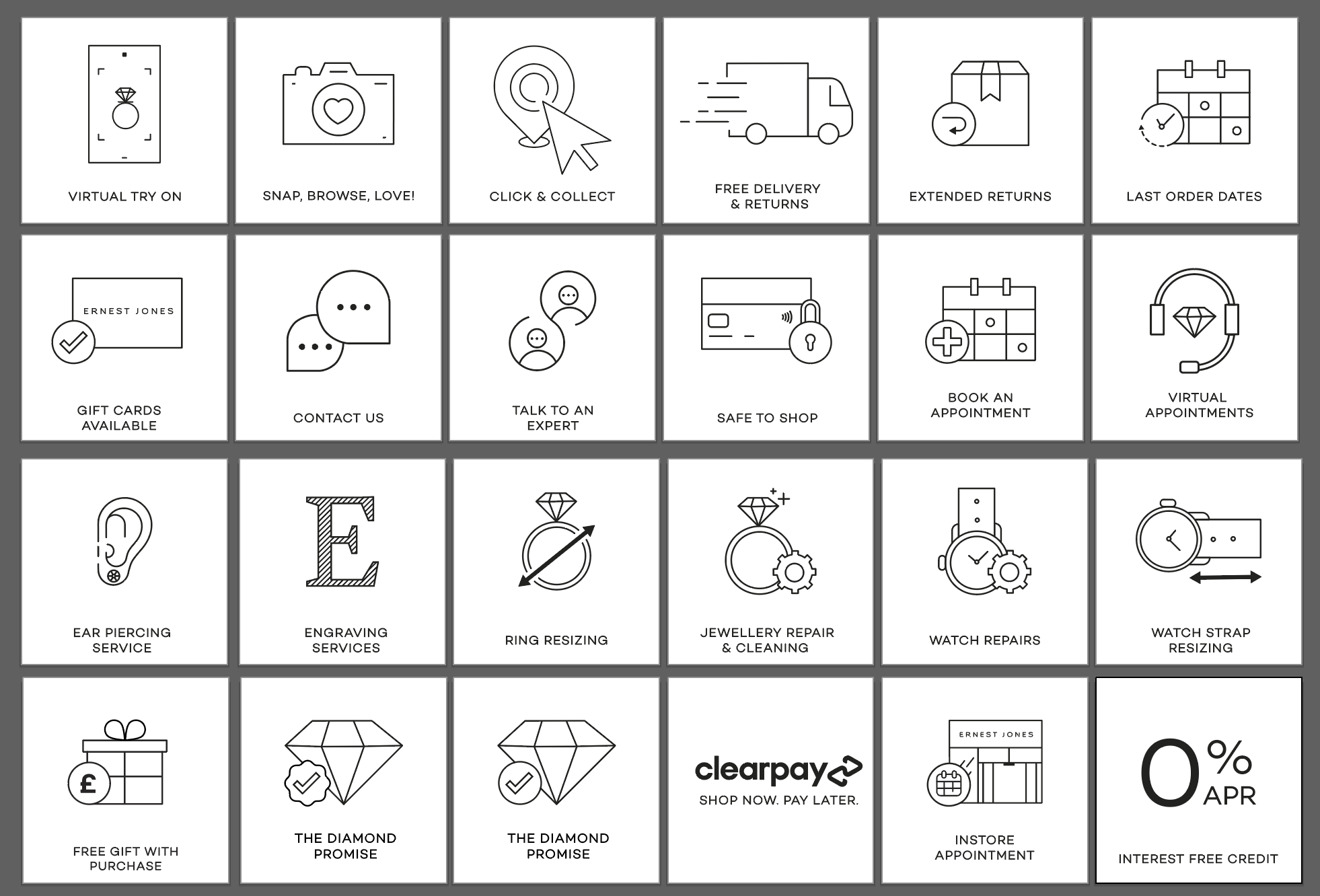
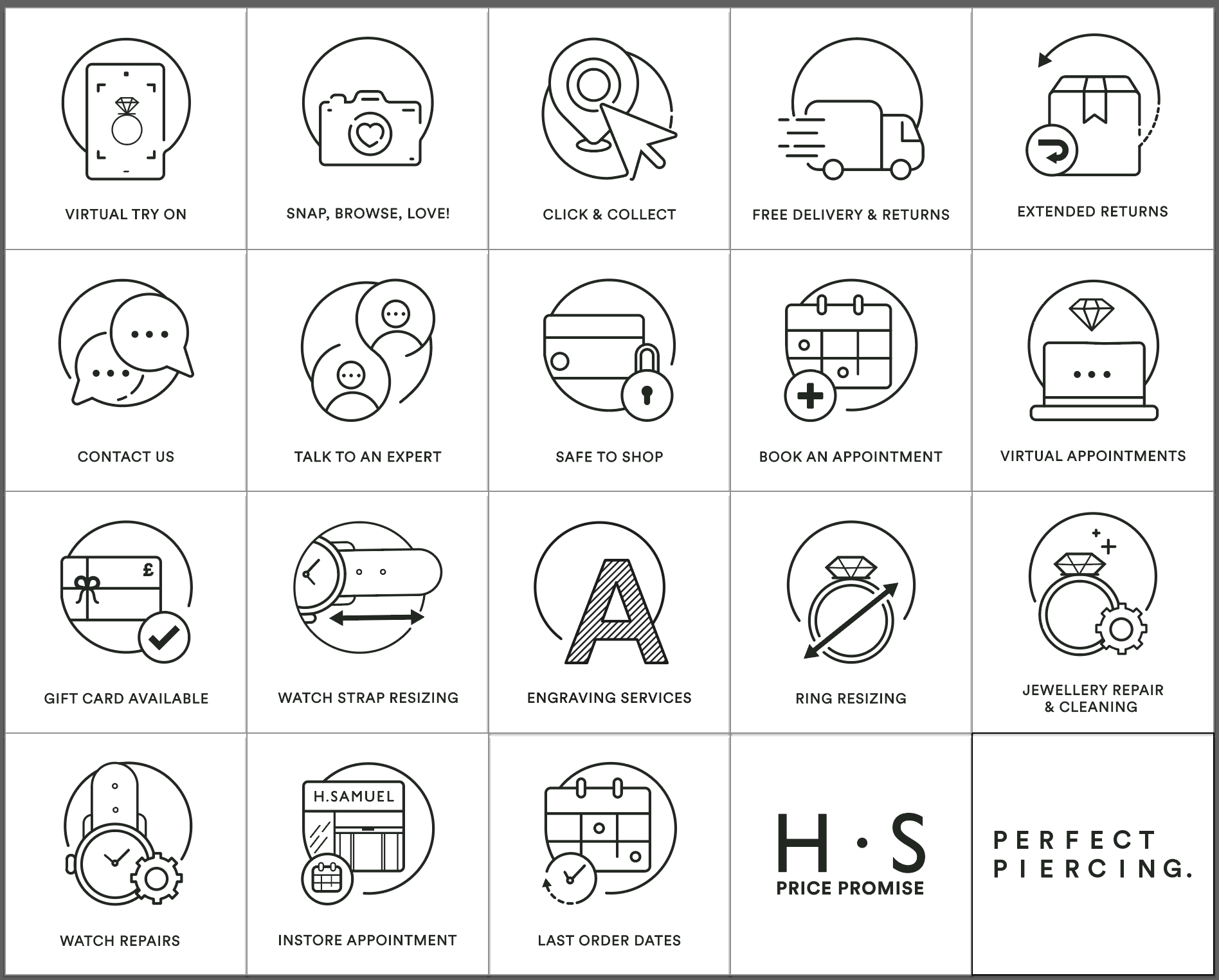
I had the exciting opportunity to refresh the icons for two major brands, Ernest Jones and H. Samuel, to be used in their emails and websites. The challenge was that they had been relying on free resource icons, which served their purpose but lacked the polished, cohesive appearance they desired. These icons varied in line height and weight, creating inconsistency in their visual identity. My task was to redesign the entire set, ensuring alignment with brand guidelines and maintaining the intended tone. This project required a meticulous approach to deliver a consistent and refined look.
The Action
To tackle this task, I began by reviewing all the existing icons that H. Samuel and Ernest Jones were using, in collaboration with the CRM team. This was to identify the icons that would be needed to create the custom package. Once we had a comprehensive list, I conducted research to explore different types of icons and styles, focusing on those with universal recognition. I kept this in mind, aiming for designs that would represent their function without relying on accompanying text.
With this completed, I used Adobe Illustrator to create the new icons, ensuring they aligned with the brand’s aesthetic and conveyed their meaning at a glance.
The image below shows Ernest Jones’s Icons designs


