BankWise App
The Concept
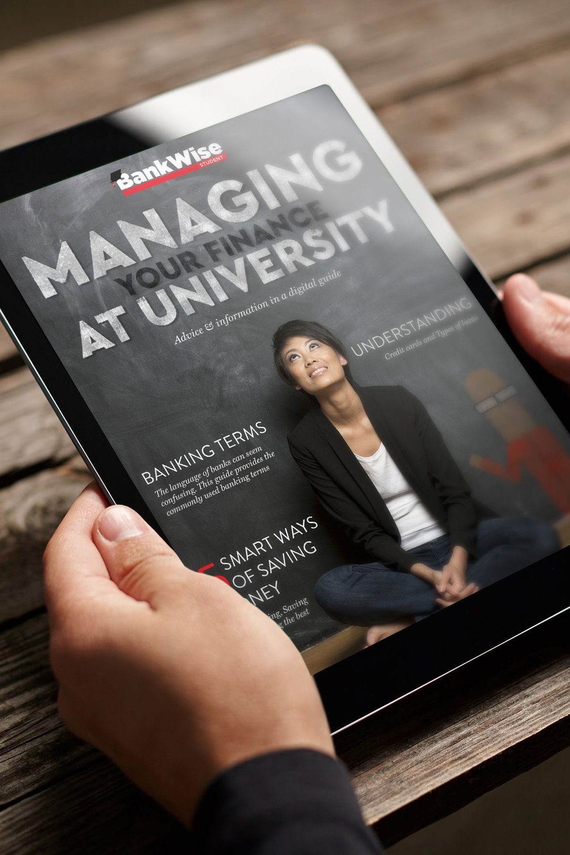
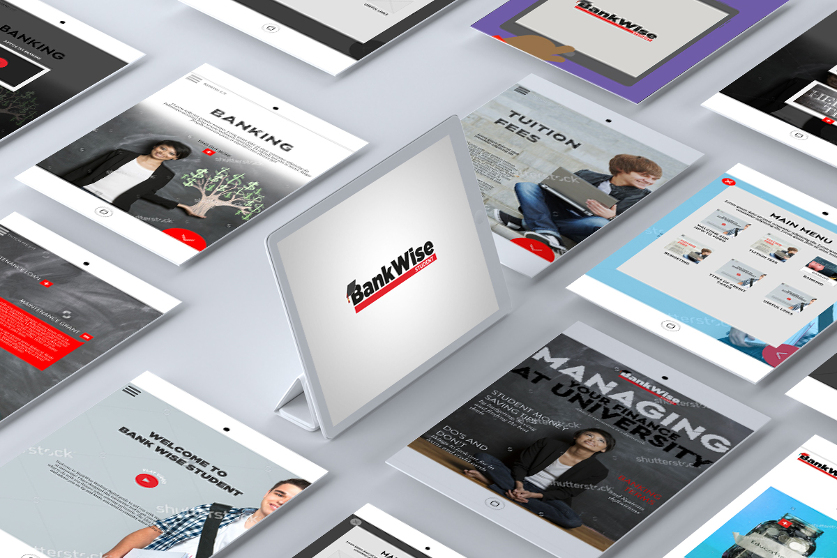
The concept behind this project was to develop a digital application that could serve as a financial guide for students. It was designed to help them understand their finances, particularly when entering university and being given a substantial amount of money to manage throughout the academic term. At the time, personal finance and banking were not part of the school curriculum, so I identified a gap and sought to fill it with my product to educate students. The app included features such as banking terminology, budgeting advice, guidance on filling out checks, and other related information.
This project was my final dissertation, and I still take pride in it, even though I recognize that some aspects could be improved with the benefit of my additional years of experience. I thought it would be valuable to share my approach to this project because it demonstrates my careful thought process and planning—skills that continue to be central to my work today.
The Branding
The target audience for the project was university students, prompting me to research student-related visuals and symbols. I created the brand name, inspired by the concept that students would gain financial literacy by using the guide. Many first-year students struggled with their finances, often depleting their funds early in the term, so the name “Bankwise” was conceived to represent acquiring knowledge of banking terminology.
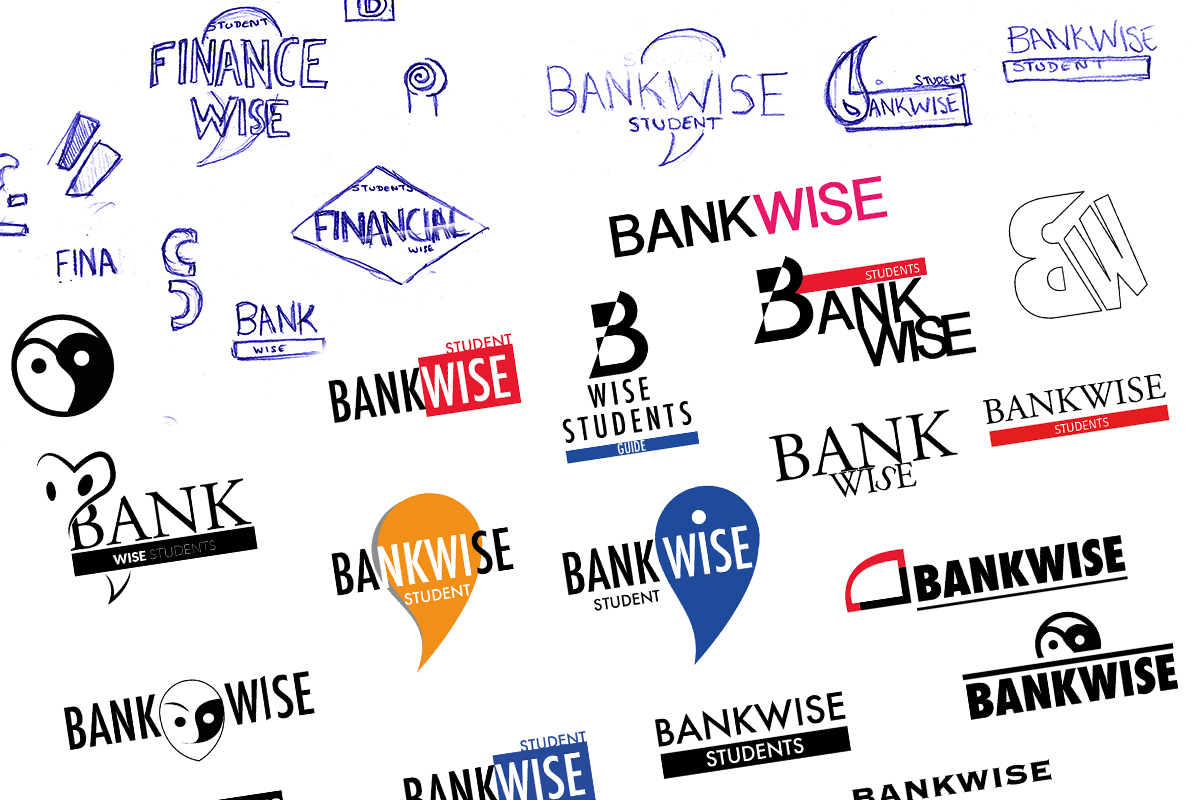
After brainstorming possible names, I sketched initial concepts before moving to digital design. I wanted the logo to have a sleek, simple appearance that was easily readable in various sizes while immediately conveying the brand’s name. I aimed to create a distinctive identity by experimenting with different design elements.
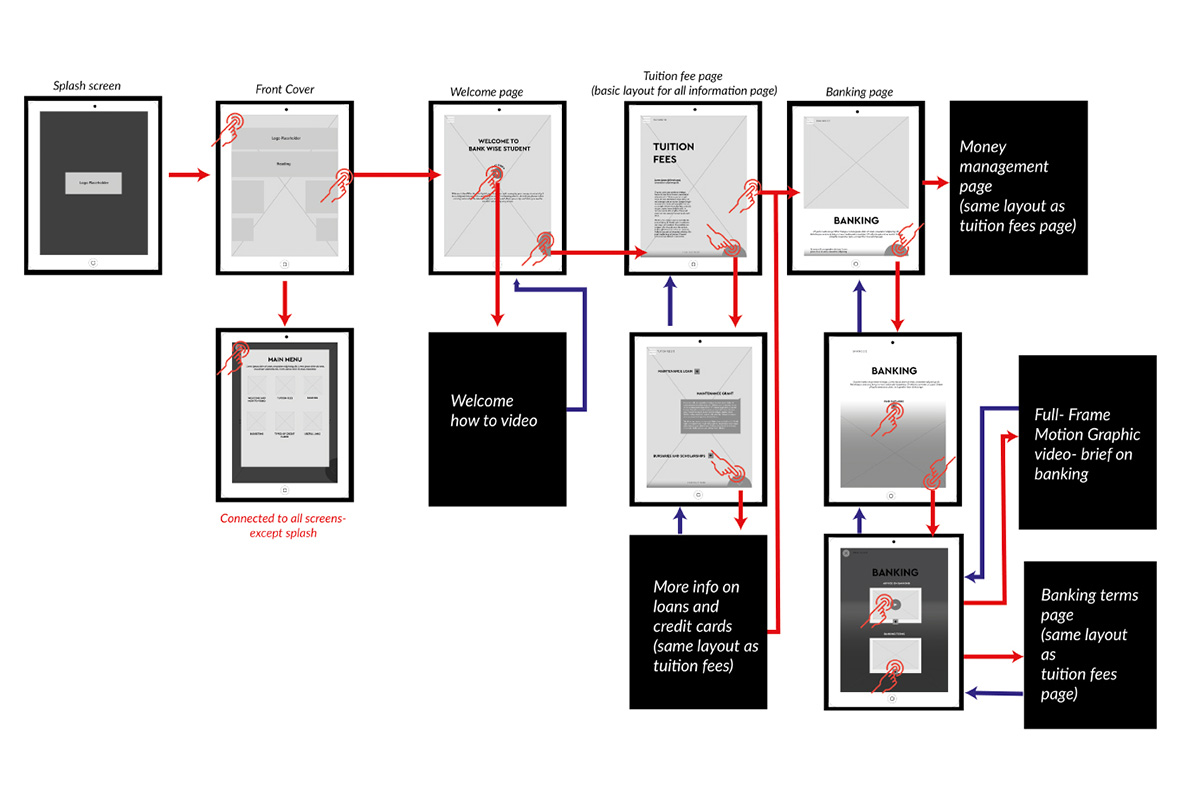
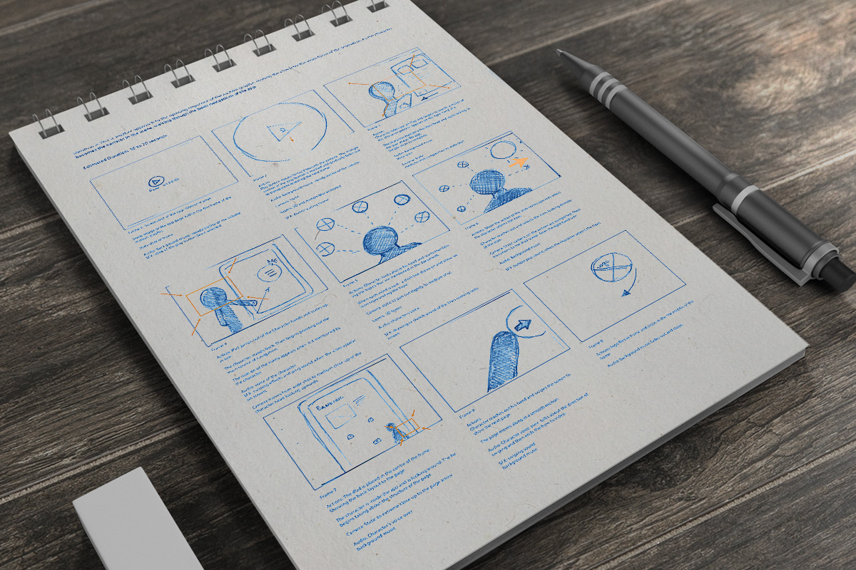
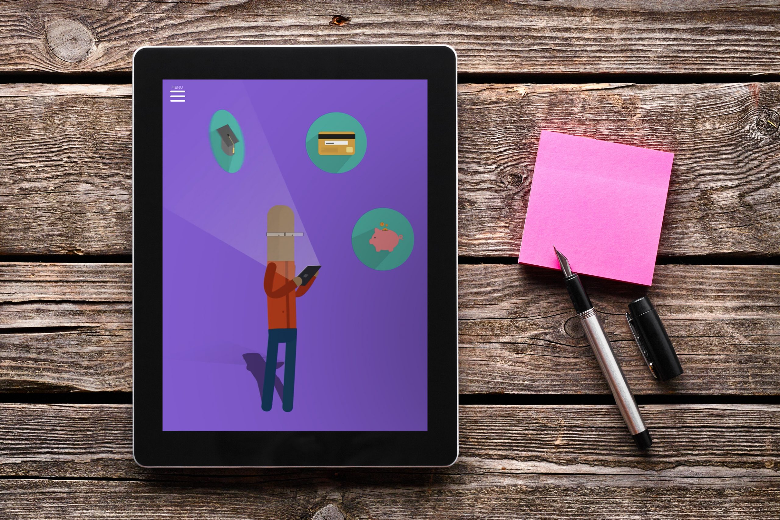
Next, I developed the app’s user flow to outline how users would navigate the product. Wireframes and mock-ups played a crucial role, allowing me to structure the information effectively and create an intuitive user experience for students to explore. This process included several rounds of testing with the target audience to refine and finalize the design.
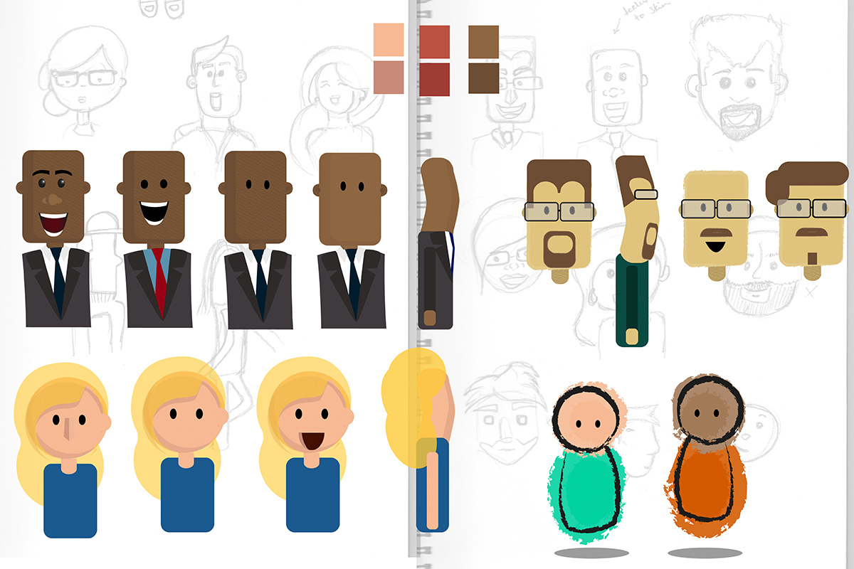
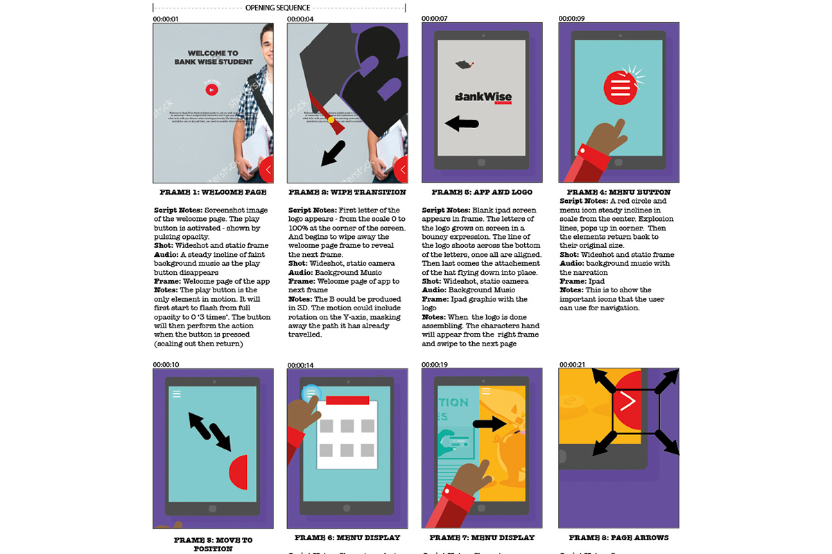
The app also featured motion graphic videos to complement the text and imagery, providing a more engaging experience. I wanted the content to be informative without overwhelming users with text, as this could deter students from using the application. The motion graphics explained how to use the app, served as a welcoming introduction, and provided guidance on budgeting.
Overall, the project was successful, especially considering it was my first attempt at app development. The functionality met my expectations, and the visuals effectively communicated the intended message. While there are areas for improvement—such as considering the app’s responsiveness to different devices—it served its purpose as a dissertation project. I hope to revisit and improve the design and functionality of the app in the future.
