H.Samuel’s
160th Anniversary
At Signet Jewelers, I was assigned the task of creating a visual campaign to commemorate a significant milestone for H.Samuel.
As a digital designer, my responsibilities included developing the visual identity and overall aesthetic of the campaign, ensuring it aligned with the brand’s ethos and history. This process involved crafting the brand’s narrative by incorporating historical timeline assets to build a cohesive story.
The Process
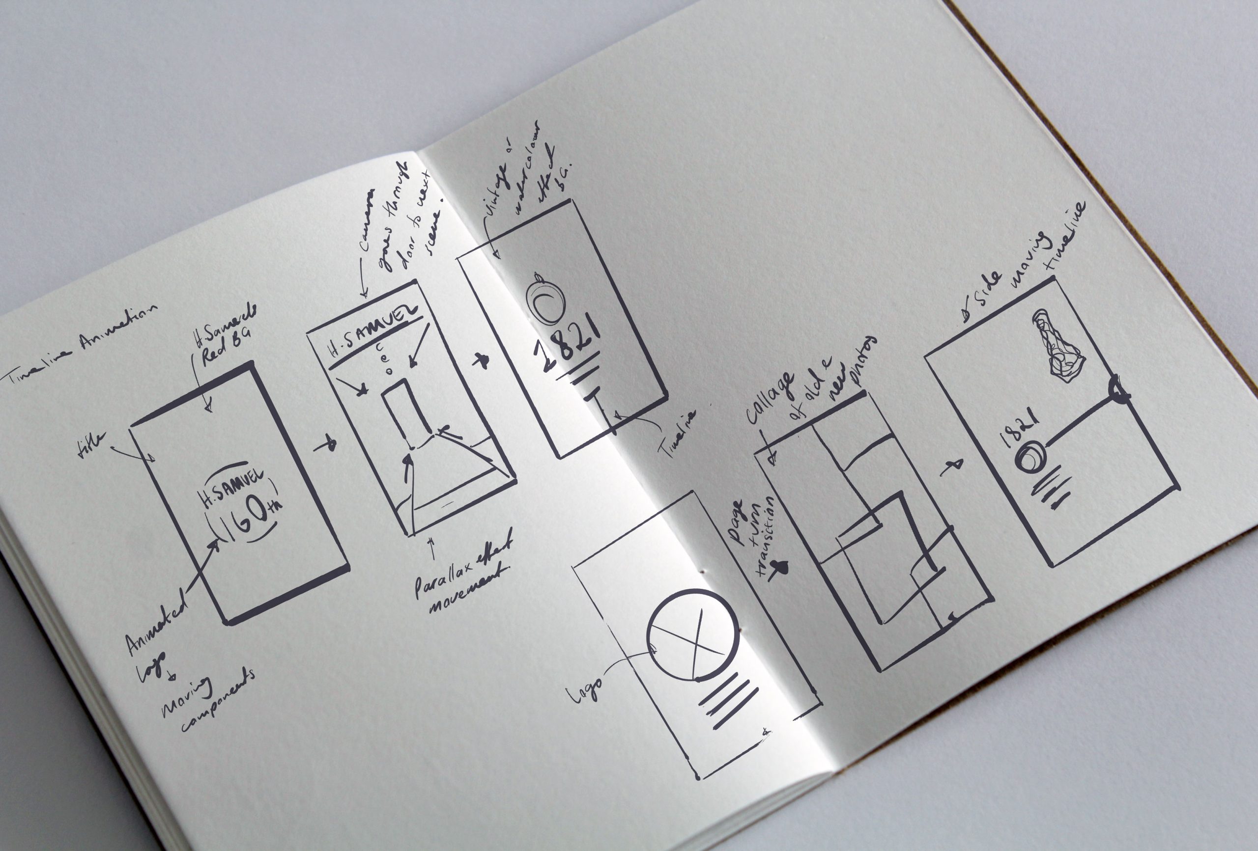
My design process involved multiple stages, starting with brainstorming sessions alongside my colleagues from the social media and marketing teams to identify the main objectives to focus on. After that, I conducted extensive research across various platforms to understand current trends and see how other companies showcase their history on social media and websites. With this insight, I created a series of rough sketches to generate ideas before developing them further in design software.
The aim was to create a social media reel that would highlight key milestones in H. Samuel’s history. I was inspired by the concept of vintage aesthetics, incorporating elements of traditional painting with watercolour effects—similar to how ink soaks into thin paper. This approach influenced how I wanted my visuals to reveal themselves as they unfolded through the timeline.
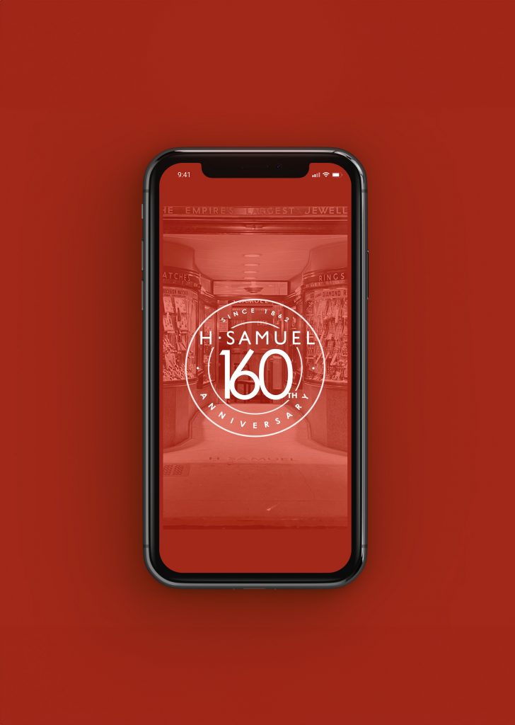
Once I had a solid concept, I created digital stills for the timeline, outlining three initial steps of the composition. I presented these designs to the relevant teams for feedback and explained my concept. After receiving approval, I continued refining my idea. I animated each component of the 160th Anniversary logo, aiming for a playful and dynamic style. I maintained this flow with the other elements to ensure a consistent look and feel. Even the choice of music was deliberate, reflecting the transition from the past to modern times.
The Results
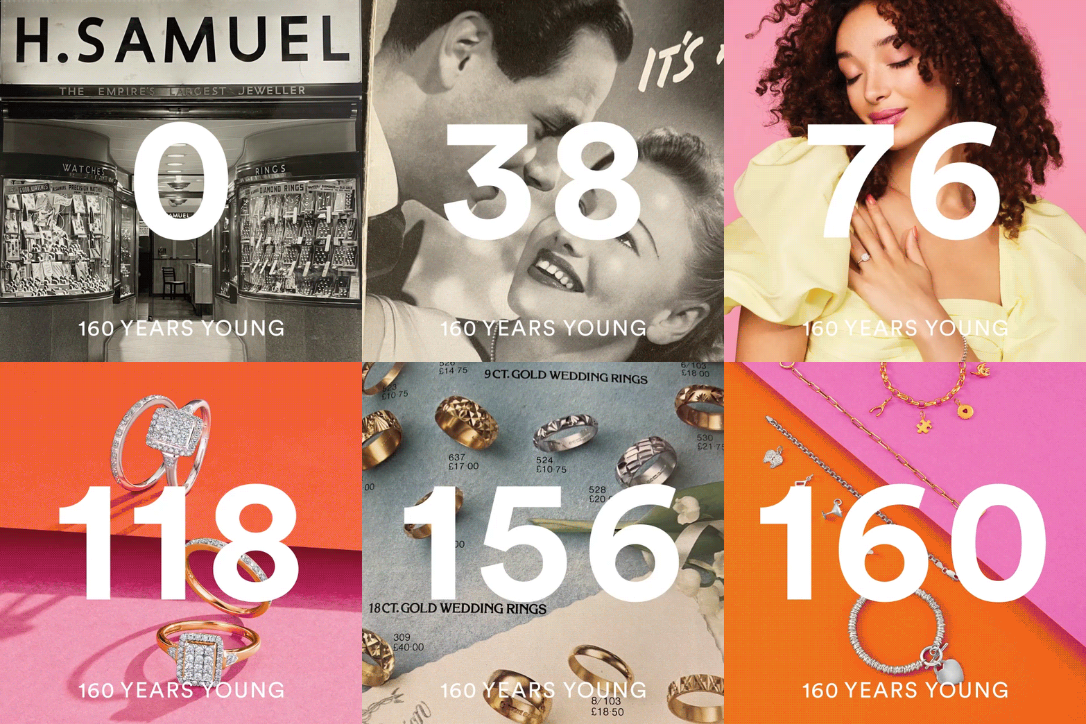
The final result was a dynamic and engaging infographic timeline. I thoroughly enjoyed working on this project as it allowed me to leverage my expertise in motion graphics and graphic design. I carefully considered colour combinations that would align with the brand’s aesthetic and message. Additionally, the use of smooth transitions and upbeat music added an element of excitement to the overall presentation, transforming what was originally a lengthy text-based timeline into a vibrant visual experience.
Softwares Used: Adobe After Effects, Illustrator and Photoshop


