Ghost Eggs Packaging
The
Design
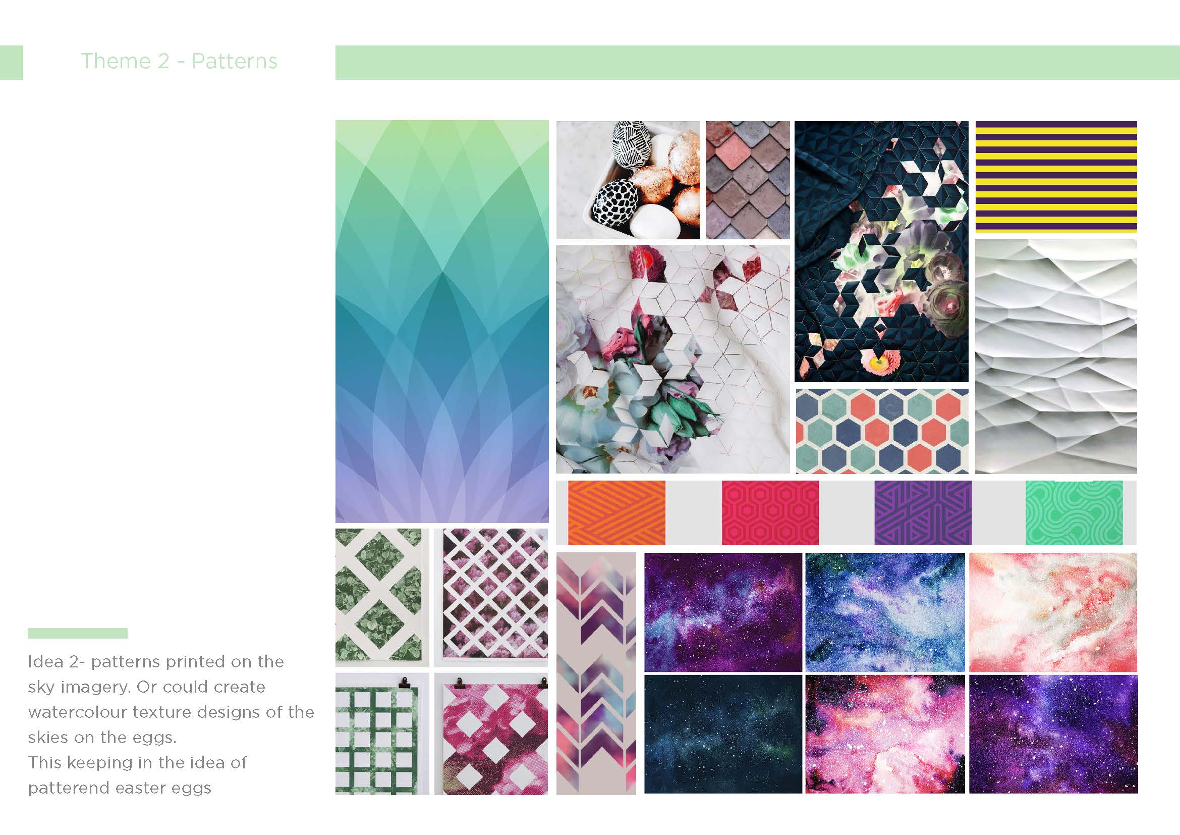
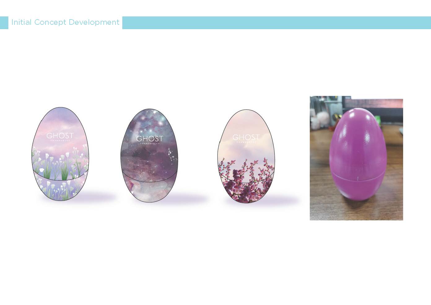
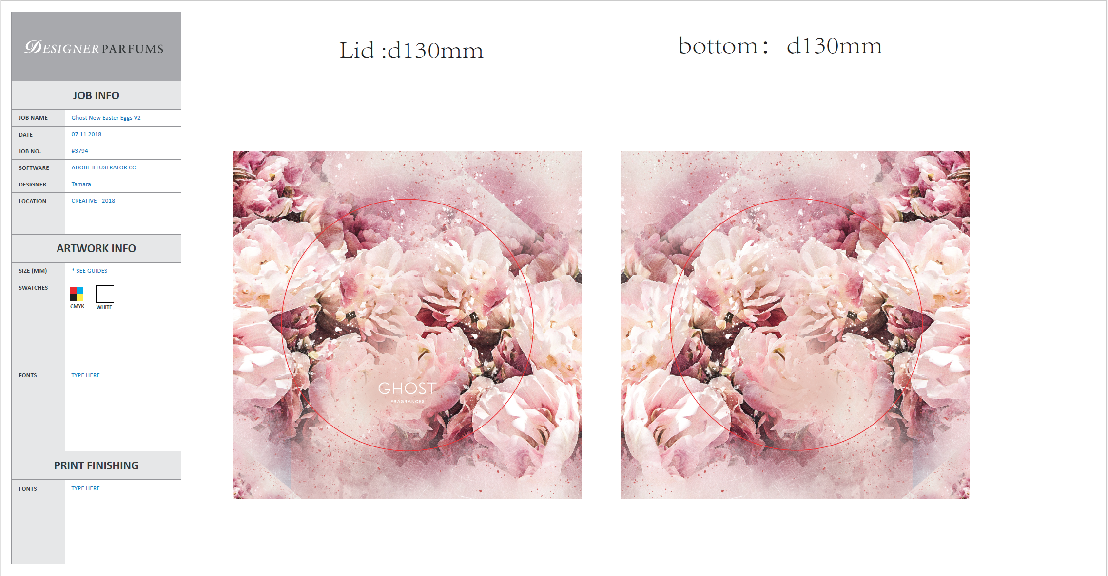
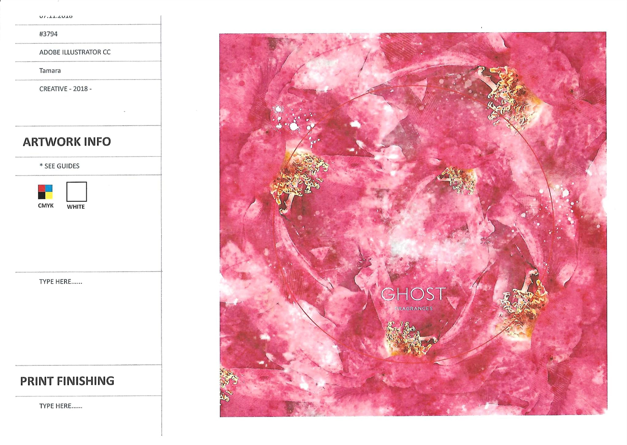
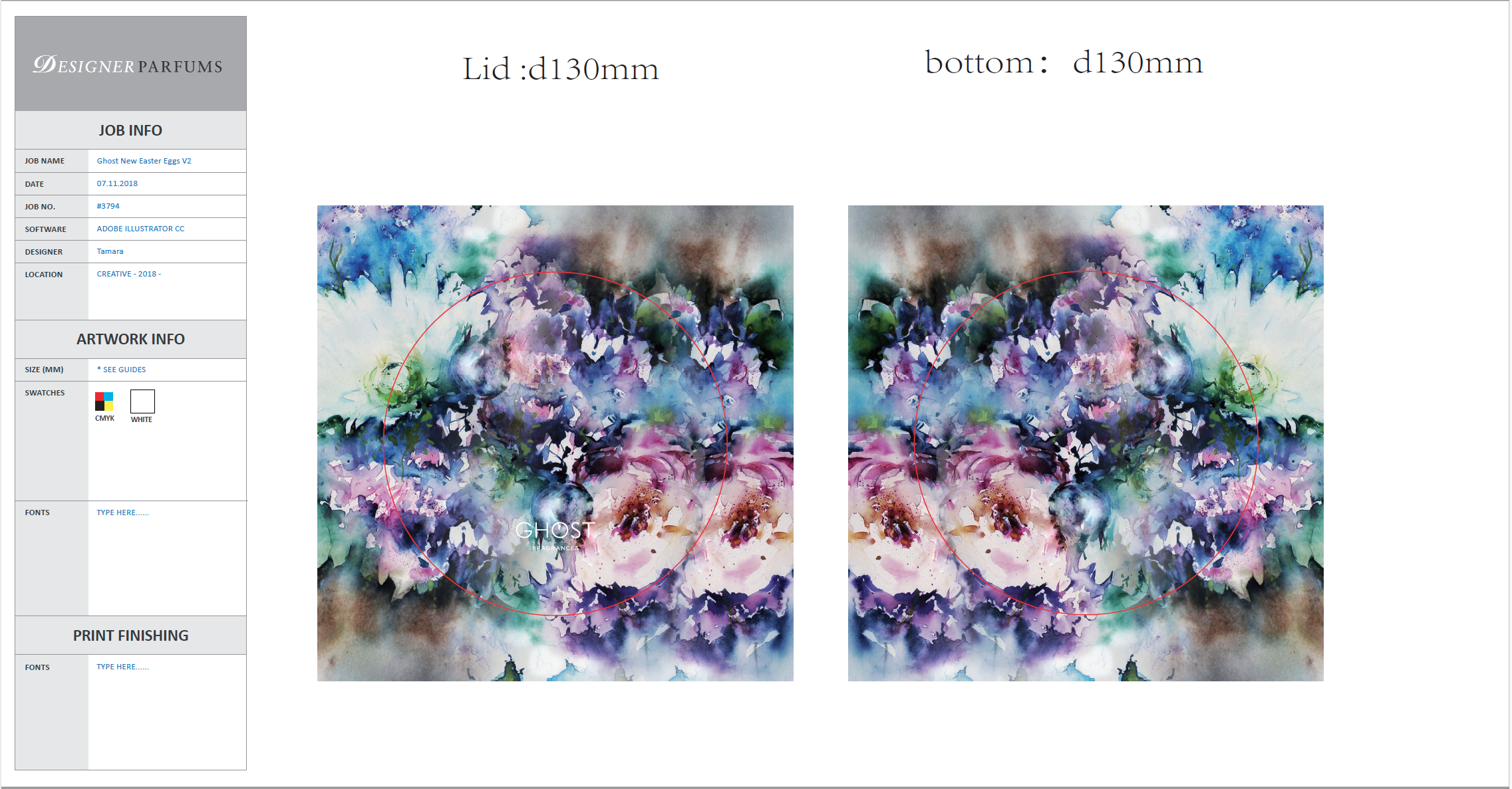
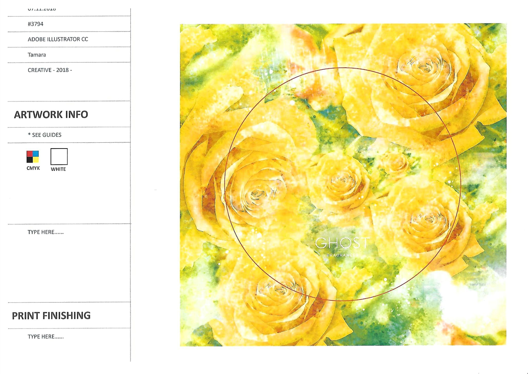
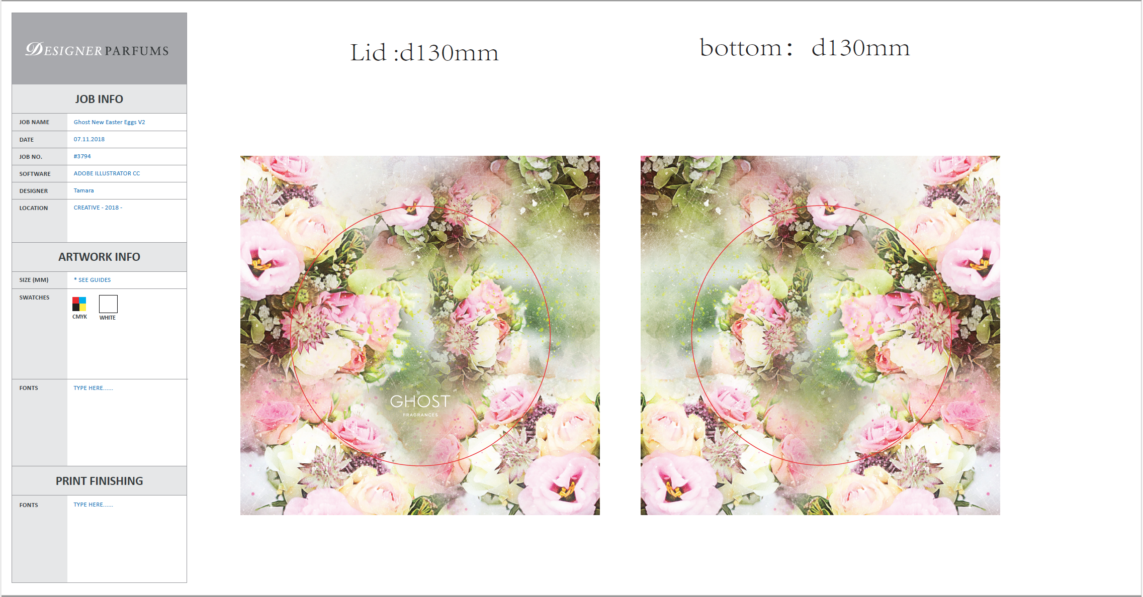
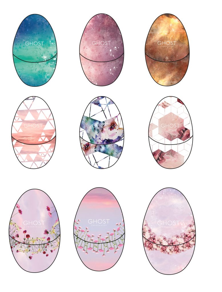
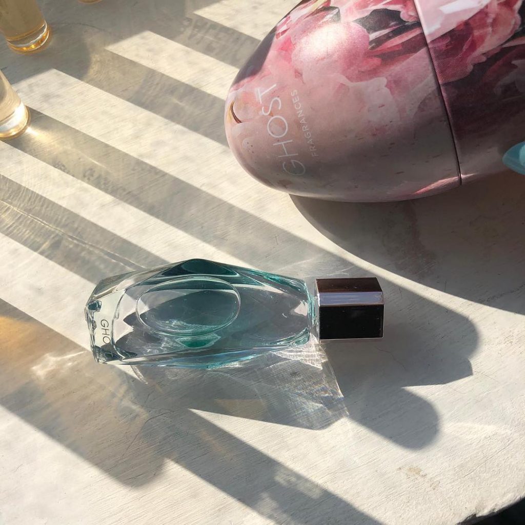
Every year, GHOST the fragrance creates gift sets for Easter, holding travel-sized perfumes. That year, they selected an egg-shaped tin. This faced challenges with the design, as the printer dipped into an ink solution during the printing process. So, I had to take into consideration the design and how the container joins together. The solution was to go for an abstract design, giving a more seamless look when the egg’s half tins are joined when closed.
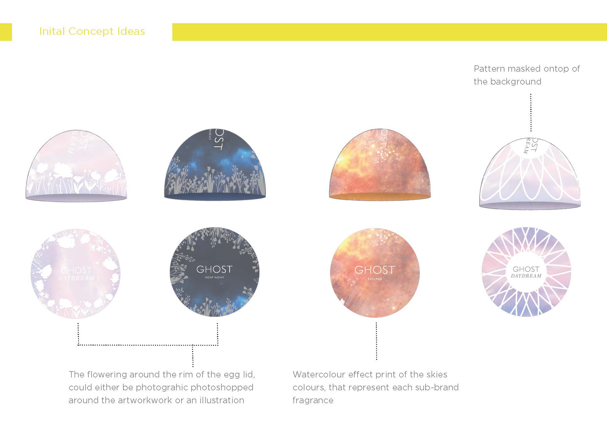
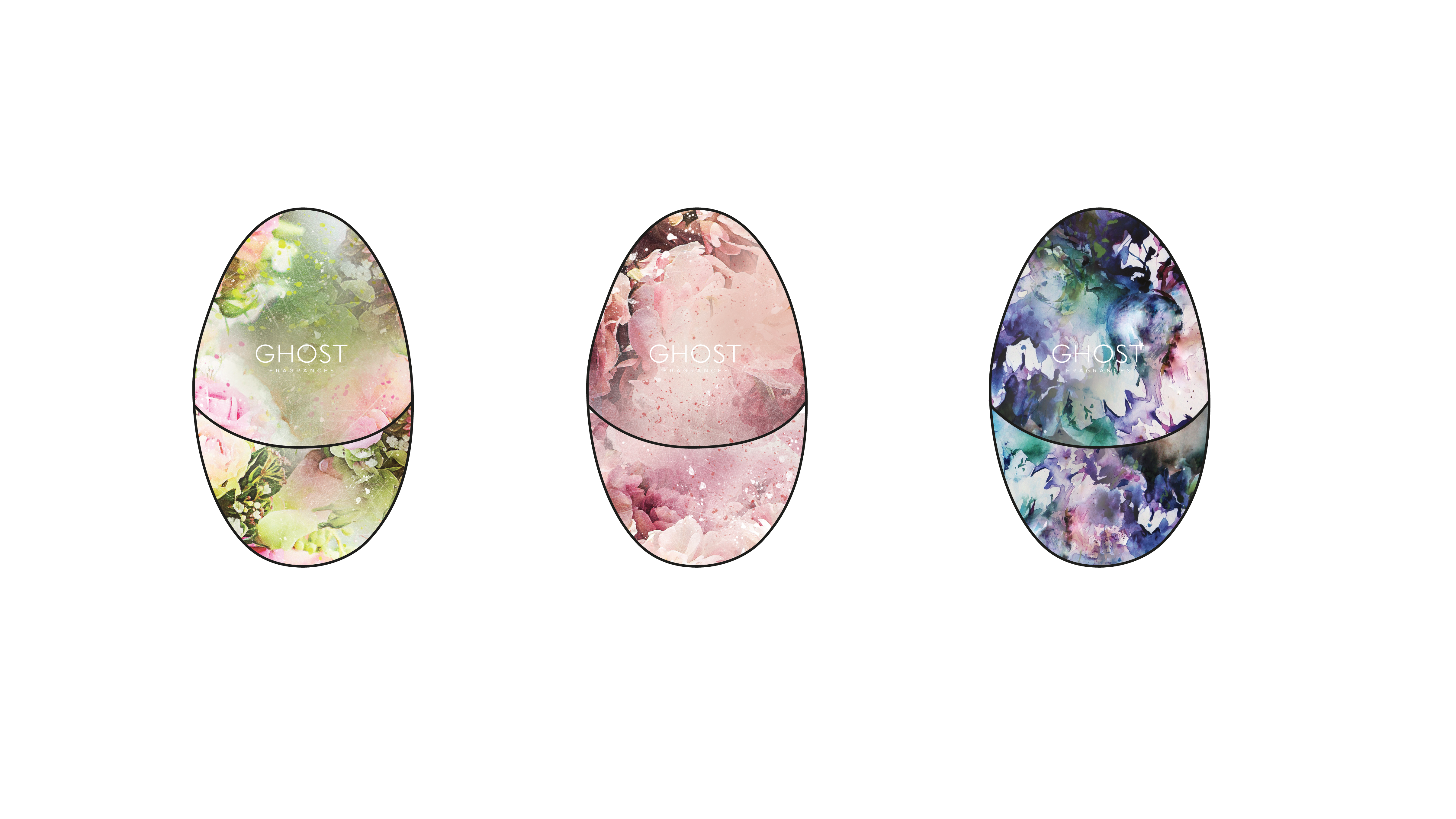
I went through various design variations and closely collaborated with the brand manager of Ghost the Fragrance until it was narrowed down to 3 product patterns.
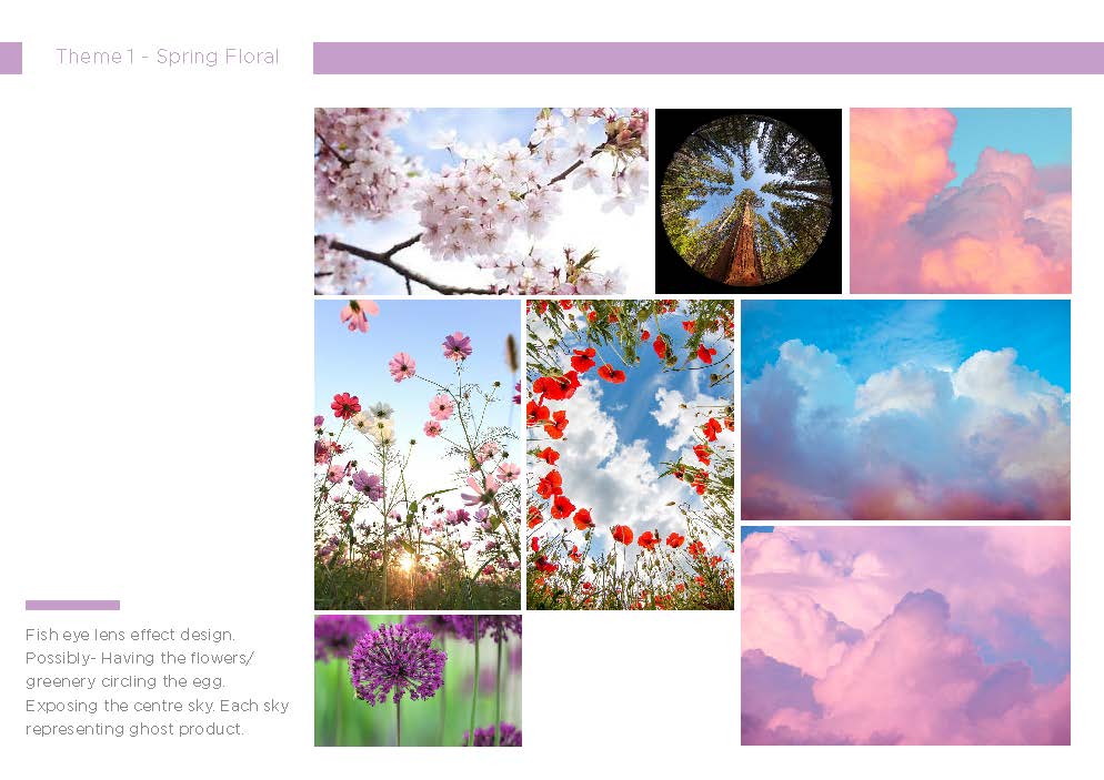
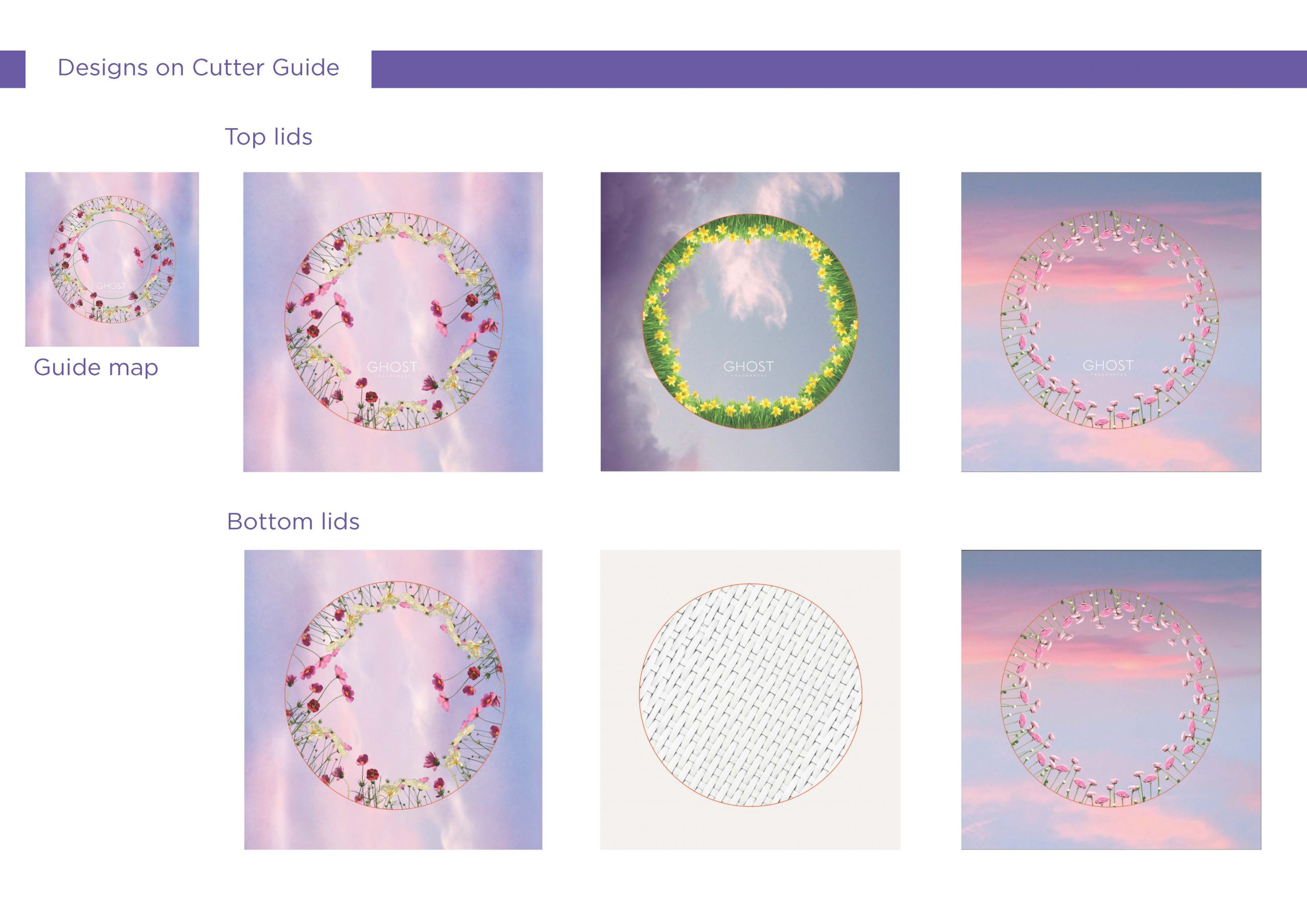
The inspiration behind the patterns was to create something within the floral and spring-like fashion in watercolour effects design. I was combining the photographic image and converting it into something that looks almost painted. I did this by precomposing the image in photoshops adding overlays and brushes to create the effect I was going for.
The Research and Development
The Artwork – Development
The
Results
One of the key challenges was related to the printing process. During the initial print trials, the logo appeared distorted when applied to the curved surface of the packaging. To address this issue, I adjusted the artwork by creating a slightly warped logo. This adjustment created the illusion of a straight logo even when printed on the spherical surface, resolving the problem in the second print trial.
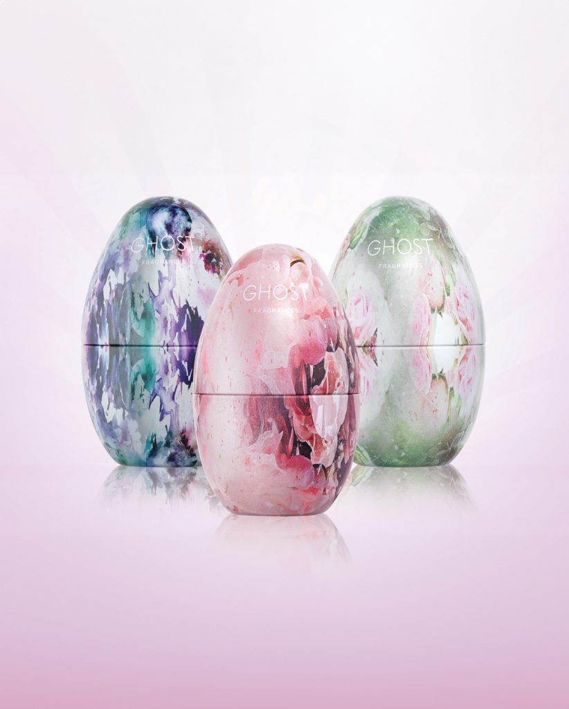
Overall, the project was a success. The unique patterns gained popularity in Superdrug stores, and the mini gift sets quickly sold out.
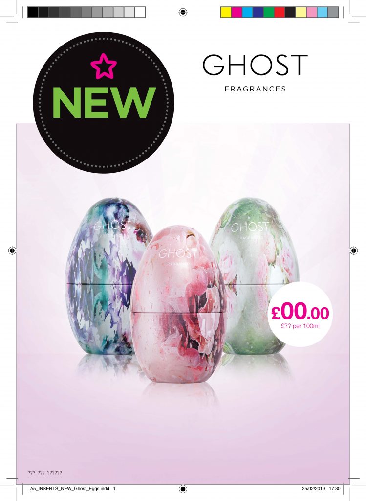
Also, these products then were featured within posters within the store and as A5 inserts (click here to see A5 insert)
The
Material
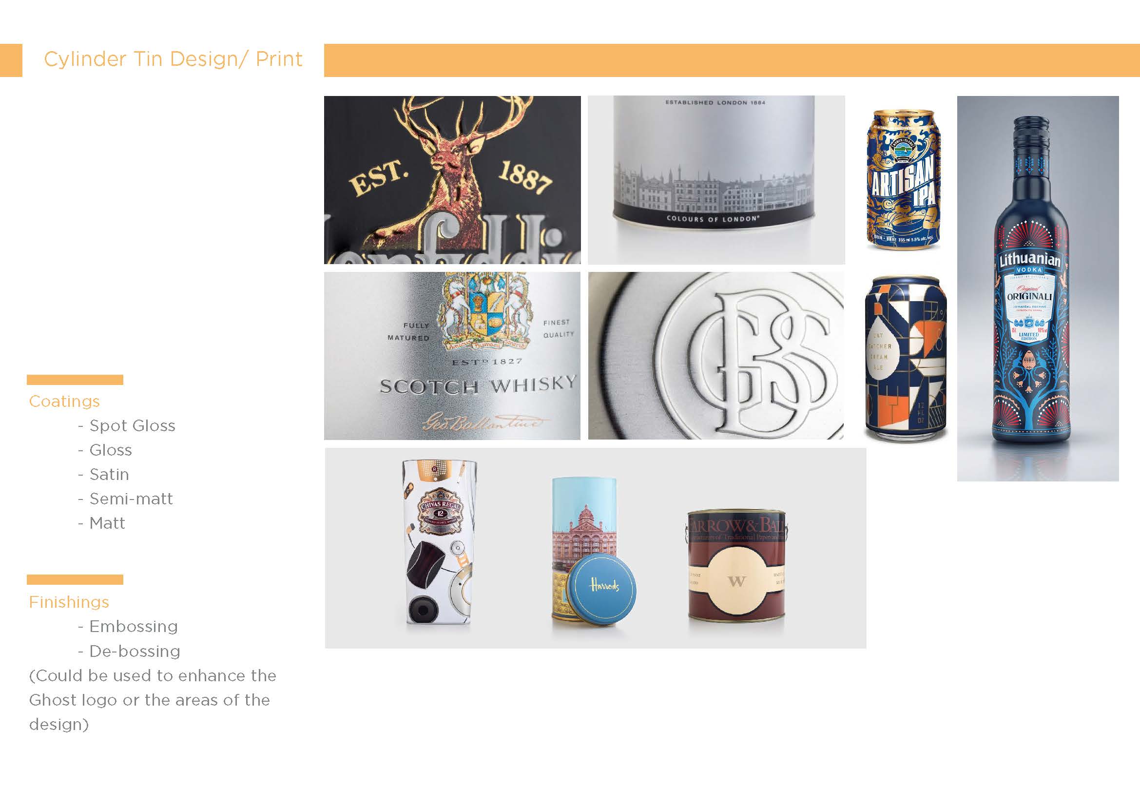
The Egg Packaging was made of tin with a satin finish.
A5 Magazine Insert
After completing the egg gift sets, I shifted my focus to creating advertising elements for Superdrug, including point-of-sale displays for security stands and posters. Below is one example of the A5 inserts I designed using Superdrug’s template. The design is relatively straightforward, but I adjusted the background to a soft purple shade with a white floodlight effect emanating from the centre. This adjustment helped create a focal point, drawing attention to the products, which already have a strong and unique aesthetic.
Software used: Indesign, illustrator and Photoshop
